In the United States, the number of adults that maintain a continuous care relationship with their doctor, particularly primary care doctors, is steadily declining. The result? A revolving door of healthcare providers with no in-depth medical understanding of you and your history, and overwhelmed urgent care centers and emergency rooms. But why? In this project, I set out to uncover the reasons for the patient-provider disconnect and designed DocFinder to address them.
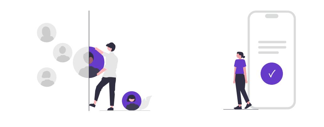
Difficulty finding the right doctor to fit the patient's specific care criteria (ex. cultural knowledge, race/ethnicity, treatment style, personality, etc.)
DocFinder addresses this problem by implementing Care Preference filter options to help adults find the right doctor match for them. This solution allows them to personalize their care and increase the likelihood of a positive care experience.
For this analysis, I compared 4 direct and indirect competitors whose platforms centered on helping people find healthcare providers. Healthgrades is the sole desktop-only platform in this group. Overall, their features are similar across the board, however, some are more consistent in their functionality than others. The main distinction seems to be in the delivery.

My goal was to learn, understand, and empathize with the experiences of patients who struggle finding primary care providers.
Criteria
Participants shared their experiences during user interviews.
After extracting the insights from my research, I found commonalities among what these adults cared about the most when looking for a primary care provider and what challenges they faced in the process.


I organized the product's features and requirements into 4 varying degrees of priority. These priorities are based on delivering a minimum viable product (MVP).

At this point, I built out the information architecture for the app. I began with the navigation bar pages and branched out to their child functions and pages.

Creating a user flow chart allowed me to step back and review the user interaction flow in a way that revealed potential conflicts and friction.

The chosen typeface and logo design are the visual voice of the app. Finding the perfect font pairing that balances distinctiveness with legibility, selecting appropriate weights and spacing, and creating a memorable logo mark establish the app's identity before patient even interact with its features.The right typographic decisions don't just look good; they build trust, guide patients through their experience, and create a foundation for your entire design system.


While blue dominates the healthcare app landscape, the decision to embrace purple charts a bold new direction. This thoughtful departure creates a distinctive visual identity in a sea of sameness. Purple's associations with wisdom, dignity, and healing make it particularly fitting for a healthcare solution. The chosen shade strikes the perfect balance between approachable, authoritative, and familiar yet fresh, while still maintaining the psychological comfort users expect from health technology. This strategic color choice doesn't just differentiate the app visually.

The chosen imagery balances professionalism with genuine warmth to create emotional connections while maintaining credibility. It incorporates playful graphic elements that reinforce the brand personality.This thoughtful approach communicates competence without coldness, creating a sense of trust. Through consistent application across all touchpoints, these images don't just decorate the interface, they actively communicate our brand promise: dependable and expert solutions with a joyful approach.


The UI Kit isn't just a collection of icons, elements, and components. It's a unified language across the app. This kit enables designers and developers to work harmoniously, accelerating production while ensuring visual consistency. Each element has been thoughtfully constructed. The result is an ecosystem of interface elements that not only looks cohesive but functions as an integrated whole, creating a product that feels intentionally designed at every touchpoint.


These were the initial sketches:


UX design without ensuring it meets user needs is simply UI design. To evaluate the effectiveness and intuitiveness of the feature design, usability tests were conducted.
Participants felt the design was intuitive and easy to navigate. I noted that all chose to opt for the camera scan feature to link their insurance instead of manually entering their details. This affirmed my design decision to implement this scan feature, however, the choice to enter the insurance details manually still exists in the event the scan fails for some users. This intentionality of this design decision was to cover the potential edge case and reduce friction/frustration for the user.
The one friction point that kept resurfacing in the tests were the actual provider search process. Questions like, "Can you only search by doctor name? What if I don’t know anyone?" and "Can I only search for primary care doctors? What about other specialties?"
At this point, I knew these were major concerns to prioritize in the iteration phase.

Exploring renaming “Care Tags” to maybe “Care Preferences” or something of the like for those who are not familiar with the tech jargon “tag” and to make it clear what the tags themselves are meant to convey.

Revisit the drawing board in terms of creating an app solely for primary care providers or for primary care providers and other specialities.

Explore ways to make the search flow smoother by minimizing the confusion about what the user could search by and what happens if they don’t know a provider name or facility name to search by (poses an edge case with immense friction)
With time in my favor, I was able to iterate on all of these items to make sure the best version of the MVP was being delivered.


This project definitely helped me fine tune and sharpen my branding skills when it came to the imagery, tone, and voice of the brand. I also learned more about the importance of testing. Testing in this project pushed me back to the drawing board when I learned from users that the likelihood a patient would use an app solely for primary care doctors was relatively low. Some people only see their primary care once a year and so they'd be more inclined to use a website or maybe use the ap and delete it after. Instead of starting from scratch, I decided it was best to open the provider directory to multiple specialities. The Care Preference tags not only improve the quality of care among primary care visits, but also among other providers, regardless of specialty.
I would've loved to create some of those additional wishlist items like the ability to create family profiles. I believe this feature would be useful for parents and legal guardians who normally set up all the medical appointments for their family member(s).


