The Call of Duty franchise dominates the first person shooter space. Its dynamic multiplayer experience is a staple for fans. But is it an inclusive experience for all soldiers on the battlefield? In this project, I spoke with visually impaired gamers to discover how a game redesign could cater to their accessibility needs.
The iconic fast-paced action of multiplayer isn't always the best experience for its colorblind gamer community. The lack of accessibility is evident when reading through player feedback.
To design a creative, but practical feature that alleviates the challenges faced by gamers with color blindness in the FPS space, particularly within the Call of Duty franchise.
Gamers are nothing if not vocal about their feelings towards games. Multiple threads on popular social media/forum sites (i.e., Reddit, X, etc.) revealed the common challenges of the colorblind gaming community when it comes to Call of Duty Modern Warfare III.

New titles are constantly flooding the FPS genre, but only a few are regarded as the franchise's main competitors today.
How do top competitors address color blindness in their games?

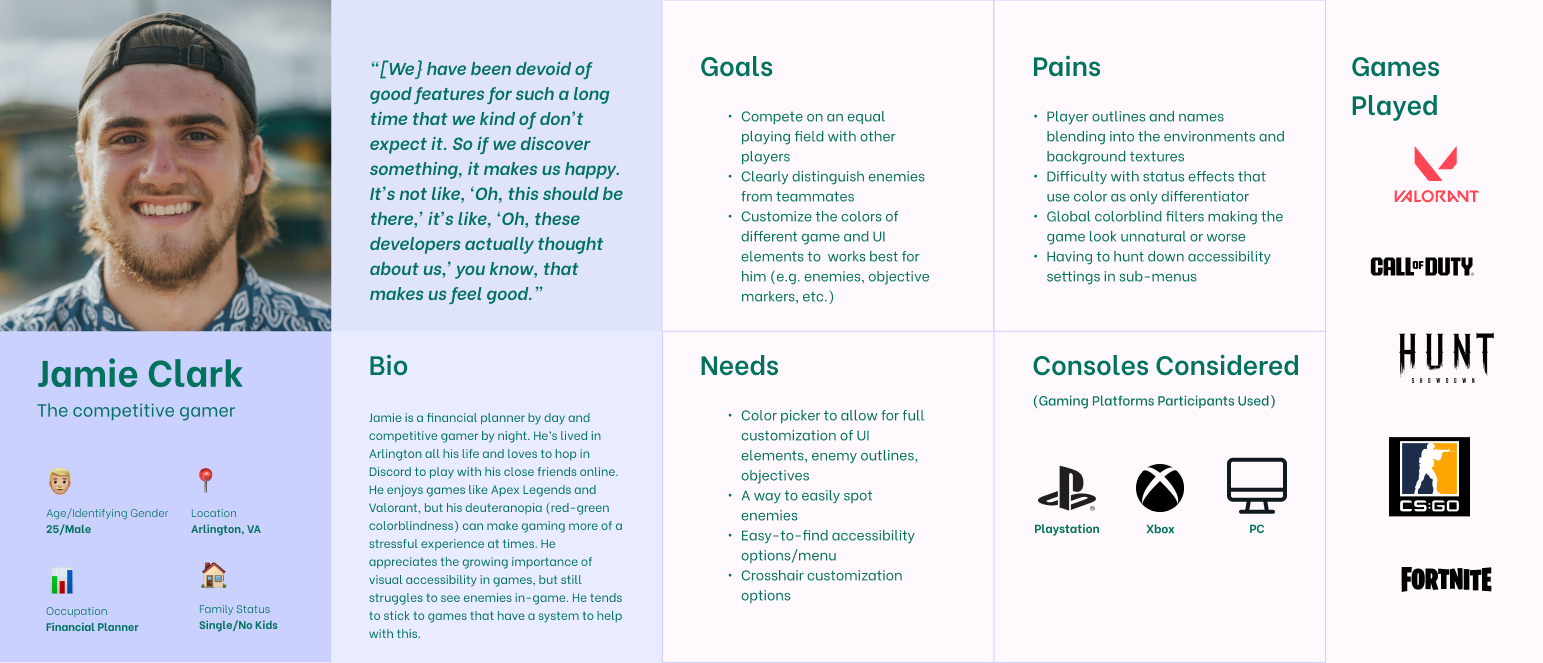
Learning from gamers who experience color blindness and/or impaired vision was a non-negotiable for this research approach.
Criteria
To ensure accessibility needs were met, Zoom and Microsoft Forms were the tools used to conduct interviews and surveys.
After conducting interviews and surveys, I used affinity mapping to extract impactful insights…
The feature roadmap is driven by user goals and prioritizes capabilities that deliver the highest impact to the colorblind Call of Duty community. I began by identifying features that address critical user needs and pain points, then sequenced development to build foundational elements before more specialized functionality. Features that serve multiple user goals or are crucial to key user flows receive higher priority, while I chose to defer nice-to-have enhancements until a later time.

When talking to gamers with colorblindness, one of the common frustrations was the ineffectiveness of colorblind presets. Color blindness looks different for everyone, therefore rendering these presets useless for some gamers. I wanted to dial in on this frustration and ensure the design incorporates more than just a handful of presets. The solution? A color picker. When I ran this idea by the research participants, they shared their good experiences with color pickers in other games.
These were the initial designs:


UX design without ensuring it meets user needs is simply UI design. To evaluate the effectiveness and intuitiveness of the feature design, usability tests were conducted.
The overall sentiment was positive. Players felt the feature was intuitively designed and simple to use since it fit into the game's original menu style. This intentionality of this design decision was to ensure learnability.

Players felt the "hover over color" bar for the presets should be present to match the current menu's hover over color design concept. This would help them know which preset they were currently previewing/hovering over.

Players suggested to possibly move the color bar to the right side with the preset name on the left to match the design structure above.

There was confusion about when the color picker interface would actually open. Does it appear while hovering over "Custom" or was it after you select "Custom".
After prioritizing the feedback, I chose to iterate only on the 1st and 3rd point of feedback to stay within the time constraints of the project.


The expertise I gained from this project in terms of game accessibility and colorblindness will stick with me throughout my design career. It inspires me to continue to learn more about accessbility in the gaming industry, where it falls in the process, how it's considered throughout the development phases, and how we, as designers, can strive to keep gaming enjoyable and accessible for all gamers.
If more time was allotted to the project timeline, I would have explored ways to help colorblind gamers identify objective markers (i.e., Domination flag markers - contested vs. securing). This was another frustration that was brought up during user interviews.